A Sampling of Typical Projects
A representative cross-section of projects small to large.
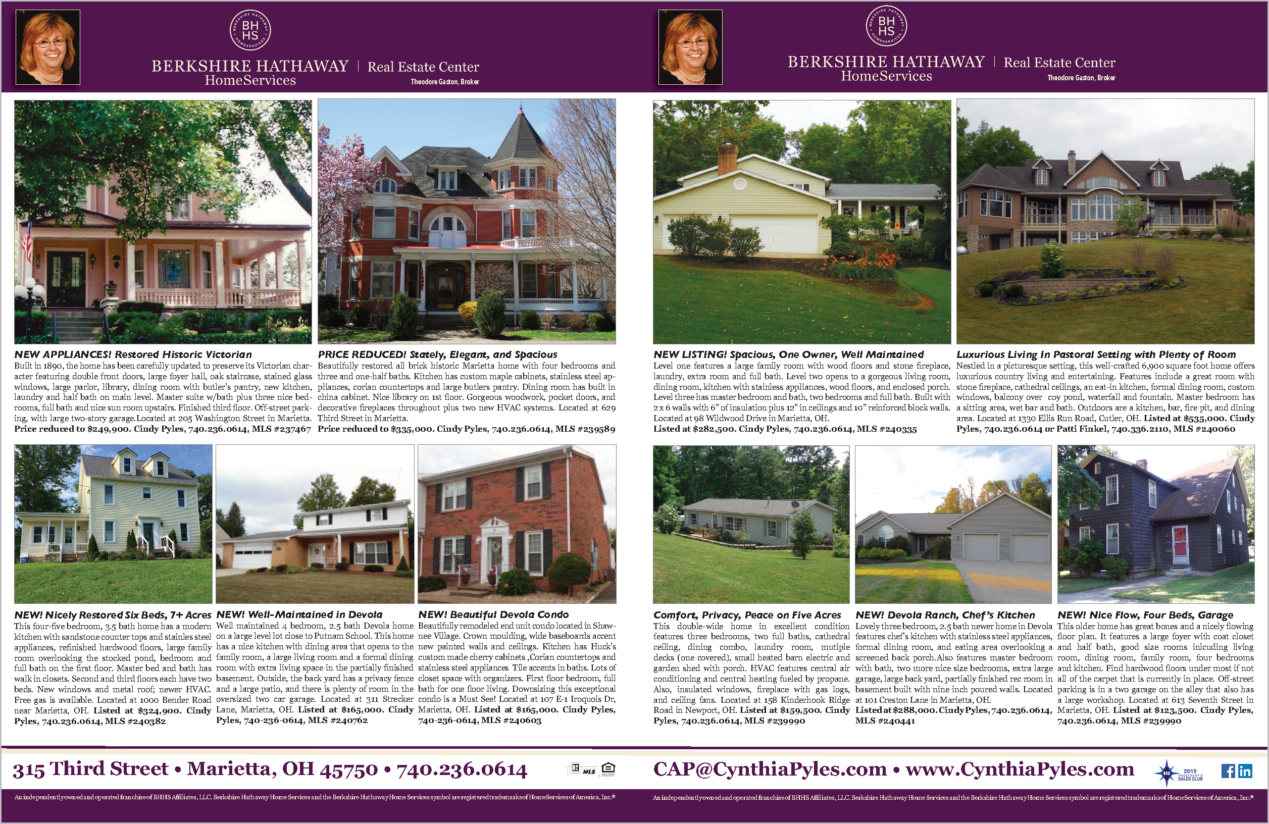
This magazine spread is designed to showcase properties in an orderly manner. Photos are cropped to the same proportion and text is composed to fit precisely within space allotted so that the reader can easily peruse the listings and quickly find properties of interest. Layouts are based on current listings, the number of properties to be featured and key messages, thus the layout may change from one insertion to the next. Colors, logos and some basic components of the ad are dictated by Berkshire Hathaway Home Services brand guidelines. Our challenge is to work within those guidelines to create the most appealing presentation.

Website for HVAC professionals.

Insurance agency website.
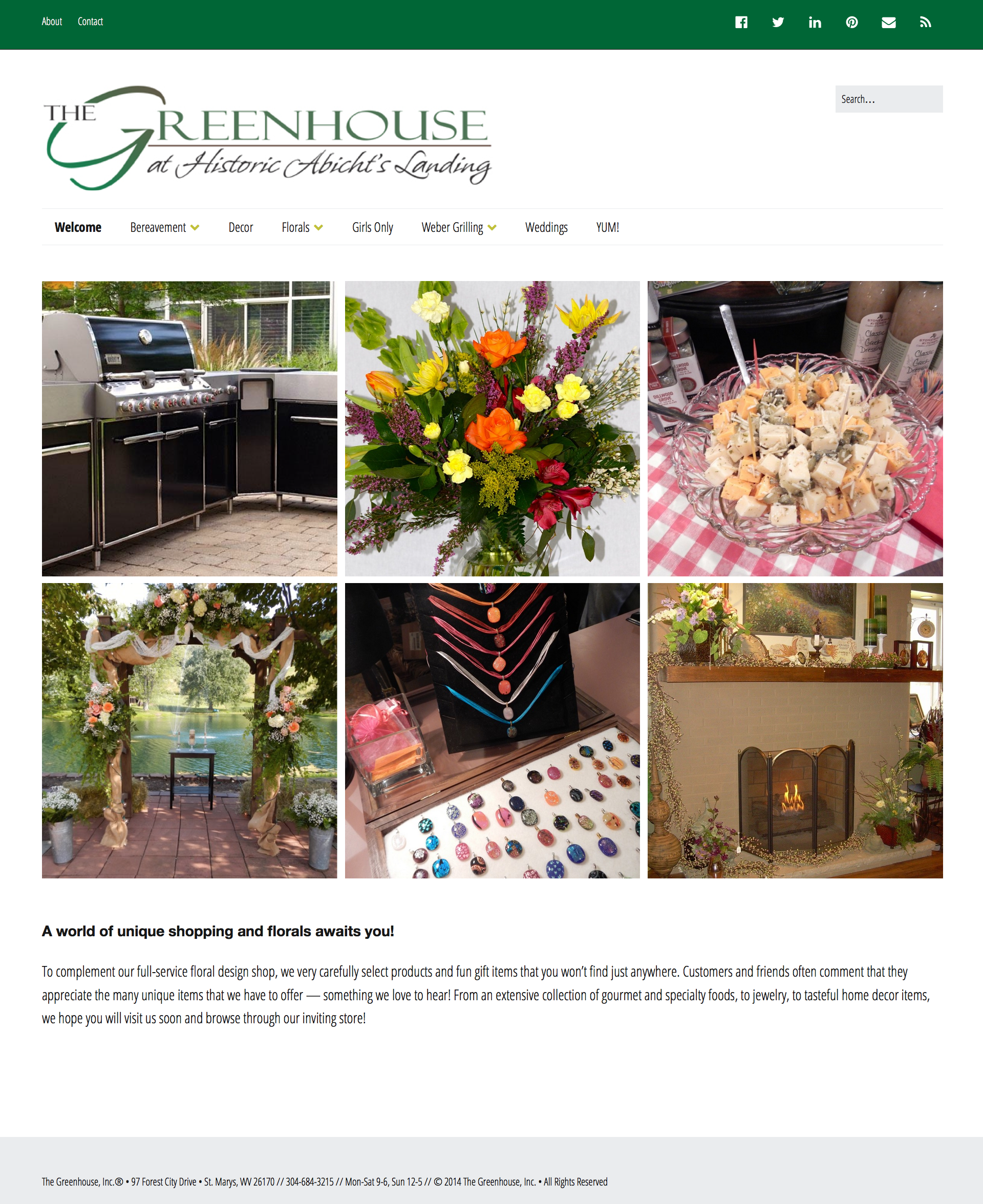
Gift shop, specialty foods and florist.

Golf tournament fundraiser flyer.
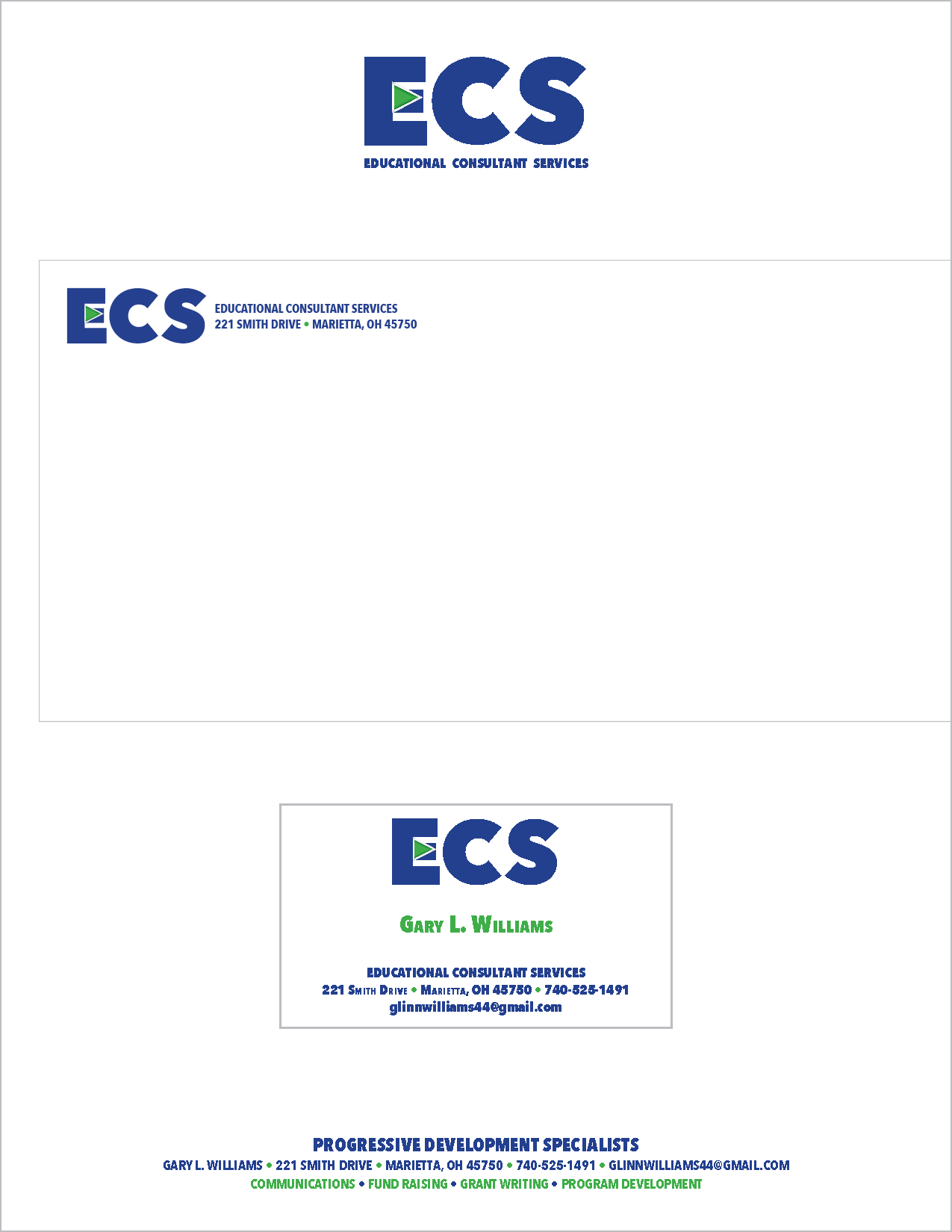
Identity for consulting group.

Capital campaign presentation.
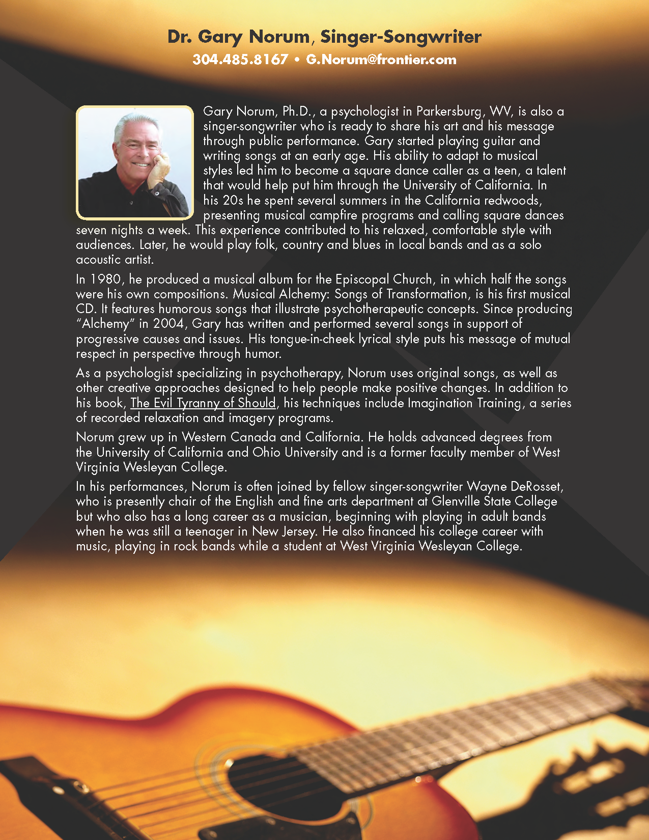
Singer-songwriter promo flyer.
Directional sign. Click for more signage.
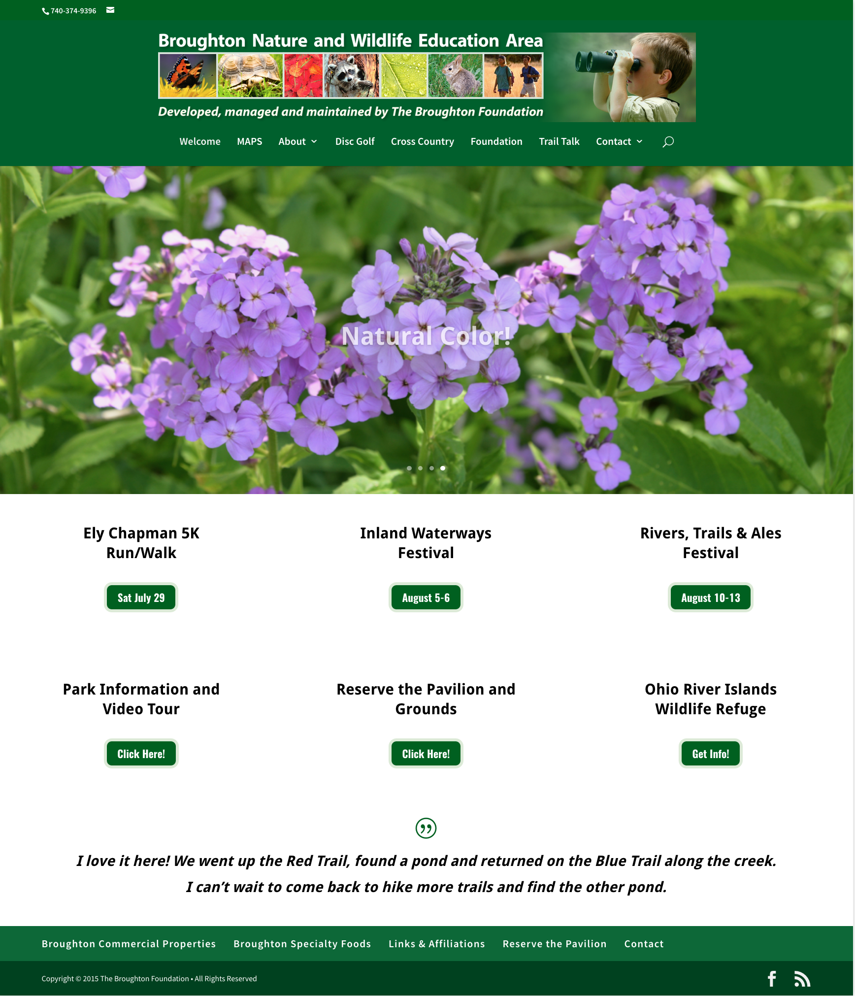
Website for The Broughton Foundation.

Foundation Annual Report.